이효섭 HEC Paris MBA/Sciences Po 정책학석사 복수학위 과정
[에듀인뉴스] 소프트웨어, 코딩을 넘어 인공지능까지. 빅데이터를 중심으로 한 응응 기술의 발전이 교육에 새로운 시대를 열고 있다. 에듀인뉴스는 ‘이효섭의 Tech 인사이트’를 통해 최신 기술 동향과 역사 간 접점을 찾아 새로운 기술의 개념과 응용 예시를 보다 쉽게 소개하고자 한다. 이번 연재는 어학 공부에 도움을 주기 위해 영문도 함께 제공한다.

거리에 호랑이를 소환하는 주문
[에듀인뉴스] 춘추전국시대에 각국은 전쟁의 발발을 최대한 억제하기 위해 인질을 교환했다. 위(魏)나라 태자와 그 스승인 방총(龐蔥) 또한 이러한 시대적 배경 가운데 3년간 조나라(趙)로 가게 되었다. 위왕의 두터운 신임을 받던 방총은 조나라로 떠나기 전에 왕을 알현하여 몇 가지 질문을 했다.
방총: “폐하, 누군가가 갑자기 저잣거리에 호랑이가 나타났다고 외친다면 믿으시겠습니까?”
왕: “그럴 리가 있나.”
방총: “두 사람이 호랑이를 보았다고 주장한다면 어떻게 하시겠습니까?”
왕: “반신반의할 것이다.”
방총: “그렇다면 세 사람이 모두 호랑이를 보았다고 한다면 믿으시겠습니까?”
왕: “아마 믿게 될 것이다.”
방총은 이어서 왕에게 간언하였다.
“폐하, 이것이 바로 소문의 고약한 본질입니다. 번화한 저잣거리에 갑자기 호랑이가 나타난다는 것은 터무니없는 말입니다. 그러나 많은 사람이 자꾸만 떠들어대면 나도 모르게 믿게 되는 것입니다.”
방총은 위왕에게 남들이 자신을 모함하는 말을 믿지 말라고 당부하고 조나라로 떠났다. 그러나 왕은 3년 후 인질생활을 마치고 고국에 돌아온 방총을 다시 만나주지 않았다.
데이터가 모든 것을 말해준다
우리는 매일 수많은 결정을 내린다. 물론 모든 결정이 똑같이 중요한 것은 아니다. 우리가 인생에서 중요하고 어려운 결정에 직면할 때, 이를 해결하는 한 가지 방법은 가능한 많은 관련 정보를 수집하는 것이다.
올해 미국 민주당 대통령 후보였던 앤드류 양(Andrew Yang)은 기존 공화당 지지자들로부터도 많은 지지를 얻어 냈다. ‘기본소득제’ 또는 ‘자유 배당’에 대한 그의 생각은 정치 주류의 관점에서는 지나치게 급진적인 것으로 간주되었다.
그러나 그의 주장이 그토록 큰 호소력을 발휘할 수 있었던 이유 중 한 가지는 자신의 주장을 뒷받침하는 데이터에 강력한 중점을 두었기 때문이다.
저서 ‘보통 사람들의 전쟁’에서 그는 자신이 현재 미국 사회에서 가장 중요하다고 꼽는 문제들과 그렇게 보는 이유를 잘 정리된 표, 그래프 및 숫자로 제시하였다.
데이터 시각화는 사람들을 설득할 수 있는 강력한 도구일 뿐만 아니라 보다 나은 의사 결정으로 나아가는 경로이기도 하다. 인간의 두뇌는 추상적인 의미를 만들어 내고 패턴을 찾는 데에는 탁월하지만 충분히 훈련되지 않는 한 여러 큰 수를 한꺼번에 처리하는 데에는 매우 약한 면을 보여준다.
데이터 시각화 도구는 이러한 부족함을 메우고 큰 숫자의 행과 열에서 의미를 빠르게 찾을 수 있도록 보조해준다. 소위 데이터가 말을 할 수 있게 해주는 도구인 것이다. 예를 들어 보자.
가. 글
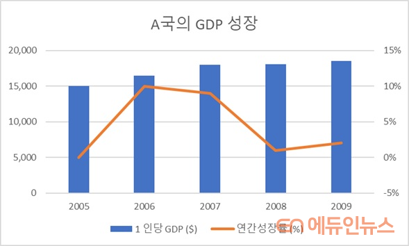
국가 A는 빠르게 성장하는 중인 비교적 발달한 나라이다. 2005 년 1 인당 GDP는 15,000 달러였으며 이듬해에는 10 % 성장하였다. 그러나 2008 년 세계 경제 위기의 영향으로 경제 성장에 큰 타격을 받았다. 다행히 역성장은 피할 수 있었다. 2008 년과 2009 년에는 비록 저성장이지만 1 %와 2 %의 꾸준한 성장세를 유지하면서 느리지만 회복세에 들었다. 2009년 A국의 GDP는 $ 18,500였다.
나. 표
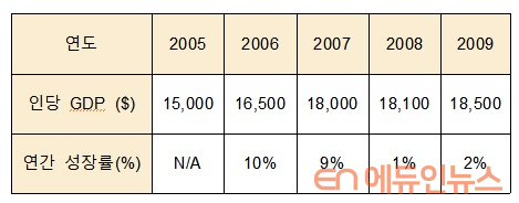
다. 그래프
생각을 자동화하다
체계적인 협력을 통해 인류는 위대한 문명을 건설하고 번영을 이룩했다. 제1차 산업 혁명은 공장과 자동화를 낳았으며, 제2차 산업 혁명은 과학적 기법을 실험실에서부터 공장 조립 라인으로 가져왔다. 제1 ,2차 산업혁명을 통해 근대의 길이 열린 것이다.
우리는 제3차 산업 혁명으로 개막된 디지털 시대가 근대와는 완전히 다른 세상이라고 착각하기 쉽다. 그러나 어떤 조직이든 여전히 체계적인 협력은 성공의 매우 중요한 열쇠이다.
생각의 점점 더 많은 부분이 알고리즘으로 자동화된 오늘날에도 경직된 규칙, 형식화된 분업에 기반한 기존 협력 체계는 관료제와 기업에서 쉽게 찾아볼 수 있다. 하나의 조직 내에서도 각기 다른 부서가 수집하는 데이터가 유기적으로 공유되지 않고 있다.
서로 다른 부서가 데이터를 각기 다른 형식으로 기록한다면 조직 전체의 그림을 정확히 파악하기 어려워진다. 여기에 정보 과잉에 제대로 반응하기 어려운 인간 두뇌의 태생적인 한계를 더한다면 문제는 더욱 복잡해지기 마련이다.
과연 늦지 않게 올바른 결정을 내리는 것이 가능할까? 예를 들어, 정부가 전염병의 위협에 대응하기위한 최선의 조치는 무엇일까?
정부는 여러 부처와 기관에 흩어져 있는 많은 데이터를 가지고 있다. 각기 다른 부처와 기관 내에서 데이터는 각 부서에서 관리하는 데이터베이스에 저장되며 수많은 사람들이 동시에 기록한다.
데이터 통합 (data integration) 및 버전 관리 (versioning)는 이러한 문제를 해결하는데 대단히 중요하다. 그 이유는 의사 결정 수준이 전산처리속도가 아닌 데이터의 품질과 절대량에 달려 있기 때문이다.

거짓말, 새빨간 거짓말과 통계
완벽하게 이해하지 못하는 정보를 처리할 때, 우리의 뇌는 자신이 인식할 수 있는 단서를 통해 이러한 구멍들을 필사적으로 채우려고 노력한다. 이렇게 되면 선입견의 영향이 증폭되기 마련이다.
데이터를 기반으로 한 주장의 설득력이 각광받고 있기 때문에 점점 더 많은 기업과 기관에서 이를 활용하고 있다.
그러나 모든 데이터가 동등한 신뢰 가치를 갖도록 생성되는 것은 아니며, 단순히 보기 쉽게 시각화한다고 믿을 수 있는 것은 결코 아니다.
따라서 인용된 데이터의 유효성과 시각적 표현의 정확성을 평가하려면 통계 및 데이터 처리 프로그래밍에 대한 기본적 이해가 중요하다.
우리가 신뢰하는 것은 필연적으로 우리가 내리는 결정에 지대한 영향을 미친다. 통계의 기초개념과 데이터 처리 프로그램의 구동 원리를 모른다면, 데이터의 본질적 무결성과 주장과의 논리적 연결성보다는 자료가 얼마나 시각적으로 매력적인지, 누가 그것을 말했는지에 현혹될 수 있다.
미국의 문호 마크 트웨인(Mark Twain)은 거짓말에는 그냥 거짓말, 새빨간 거짓말, 그리고 통계가 있다는 말을 남겼다고 한다.
통계분석 프로그램은 이제 점점 더 많은 기업과 기관이 쉽게 사용할 수 있는 강력한 도구 중 하나다. 향후 진로를 위해 이 두 분야를 전문적으로 학습하고 공부하는 선택은 개인에게 달려있는 문제다.
그러나 그 기초 원리를 이해하는 것은 오늘날 지성을 갖춘 교양인이 소통하기 위해 필수적인 전제가 되어가고 있다.
데이터의 한계와 내가 의식적으로 사고해야만 하는 영역을 분별하는 역량은 통계수치나 화려한 시각화 자료에 현혹되지 않고 올바른 결정을 내리기 위해 필수적이기 때문이다.
◇ 관련 동영상
- 3 lessons on decision making from a poker champion
https://www.ted.com/talks/liv_boeree_3_lessons_on_decision_making_from_a_poker_champion?language=en
- How Statistics can be misleading – Mark Liddell
https://www.youtube.com/watch?v=sxYrzzy3cq8
Statistics and Programming: Looking under the hood
Conjuring a tiger in the street
In the Warring States period of China, nations traded hostages to suppress the outbreak of military conflict. As is customary, in one such occasion the crown prince of Wei (魏) and his teacher Pang Cong (龐蔥) were sent off to Zhao (趙). Pang Cong, a trusted official of the King of Wei, asked the King a series of questions before leaving for Zhao.
Pang Cong: “Your Majesty, if someone just ran in to your court shouting that there is a tiger roaming in the market, would you believe it?”
The King: “No, I would not.”
Pang Cong: “What if two people claimed they saw a tiger?”
The King: “I will begin to wonder.”
Pang Cong: “Then, what if three people all claimed to have seen a tiger?”
The King: “I would believe it.”
After that, Pang Cong said, “Such is the nasty nature of rumors. The notion of a tiger suddenly appearing in a crowded market is ridiculous. However, when more people claim it, a live tiger can be conjured through words.”
Pang Cong continued to advise the King not to trust any slanderous talk against him. Yet, when Pang Cong returned to Wei years later, he was not even allowed to see the King.
Let the data speak for itself?
We make countless decisions every day. Of course, not every decision is as significant as the other. When we are faced with difficult and important decisions in life, one way to deal with them is to collect as much relevant data as possible.
Andrew Yang, who was a US Democratic presidential candidate this year garnered sensational support, even from Republican supporters. His idea of universal basic income, or “freedom dividend” as he called it, was deemed too radical by mainstream politics. However, one reason his movement had such a wide appeal was his emphasis on data to make his case. His book, “The War on Normal People,” is laced with tables, graphs and numbers to show what and why he views as the most important problems for America.
Data visualization is not only a powerful tool to persuade people, but also often a path that leads to better decisions. While the human brain is exceptional at creating abstract meaning and finding patterns, it is not so good with sets of big numbers, unless trained to process them in familiar contexts. Data visualization tools help fill that gap and help us find meaning in rows and columns of big numbers. It is a tool that lets the data speak for itself to our eyes. Let’s try an example.
A. Statement
Country A was a fast growing, moderately advanced economy. Its 2005 GDP per capita was $15,000 and it grew by 10% the next year. However, the impact of the global economic crisis of 2008 has severely stunted its economic growth. Yet, it did not experience any negative growth. Instead, it was on its way to slow recovery, sustaining a single digit but steady growth of 1% and 2% in 2008 and 2009. Country A’s GDP in 2009 was $18,500.
Of the three, C is the easiest to understand intuitively. Our minds are wired to rapidly respond to the visual representation of these numbers. Graphic representation is naturally much easier to register and understand for our brains.
B. Table
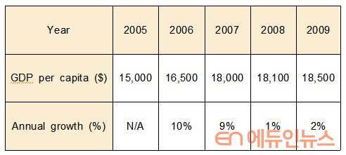
C. Graph
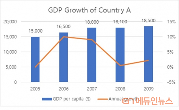
Of the three, C is the easiest to understand intuitively. Our minds are wired to rapidly respond to the visual representation of these numbers. Graphic representation is naturally much easier to register and understand for our brains.Thought automation
Systematic cooperation has enabled humanity to build civilizations and accomplish prosperity beyond any species in nature. The First Industrial Revolution gave birth to factories and automation, while the Second Industrial Revolution brought science from the laboratory to the factory assembly line. These two movements paved the path to the modern world.
We are tempted to believe that the digital era ushered in by the Third Industrial Revolution is a completely different world from the dawn of modernity. However, cooperation is still critical to success in any organization. The old system of cooperation built on rigid rules and formal division of labor persist today, even when more and more parts of our thinking is being automated with algorithms. Even today, different parts of the same organization have access to different sets of data and information.
When data is recorded in different formats across multiple teams, it is difficult to understand the whole picture. Combine this problem with how bad humans are with large sets of data. Will it be possible to make a good decision on time? For example, what is the best course of action for the government to react against the threat of a pandemic?
Governments have a lot of data scattered around different ministries and agencies. Inside those different ministries and agencies, data is stored in isolated databases managed by each department simultaneously recorded by countless people. Data integration and versioning are critical to make the best use of modern computing prowess as the quality and quantity of data, not the computing speed, determines the quality of output and decisions.
Lies, damned lies and statistics
When we see something we don’t fully understand, our brains desperately try to fill in the holes in our understanding through the clues it can recognize. When this happens, the effect of our biases is amplified. As data driven arguments prove greater effectiveness, it increases in popularity. However, not all data is created equal and not all graphic data should be trusted. Therefore, a basic understanding of statistics and data processing programming is critical to evaluate the validity of the data cited and the accuracy of its visual representation.
What we believe in inevitably determines the decisions we make. Without a minimum basis of understanding the fundamental concept of statistics and how modern data visualization programs process data, we can fall prey to believing an argument based on how visually appealing the infographic is, who (or which organization) presented it rather than the integrity of the data and the logical connection with the main argument.
Mark Twain is credited to have popularized the phrase “there are three kinds of lies: Lies, damned lies, and there’s statistics.” Statistics and programming are two of the most powerful tools that are increasingly available to companies and governments alike. Making a serious commitment to study these subjects to pursue a career in them is a matter of personal choice. However, understanding the basic building blocks of statistical logic is simultaneously becoming vital to communicate intelligently. The ability to discern the very limits of these tools to apply our own minds to think will save our important decisions from the worst of lies.
◇ Also Watch
- 3 lessons on decision making from a poker champion
https://www.ted.com/talks/liv_boeree_3_lessons_on_decision_making_from_a_poker_champion?language=en
- How Statistics can be misleading – Mark Liddell
https://www.youtube.com/watch?v=sxYrzzy3cq8

이효섭 HEC Paris MBA/Sciences Po 정책학석사(Digital, New Technology and Public Policy) 복수학위 과정=고려대 법학과/경영학과를 졸업한 이효섭 씨는 전 국방부 국제정책관실 통역장교, 전 ㈜한국항공우주산업 KF-X 및 APT 사업 계약협상 담당과장을 지냈으며 Palantir Technologies 런던사무소 근무 예정이다.
"억지로 공부해서 대학도 가고 대학원도 왔지만, 공부하는 재미를 이제서야 깨우친 아저씨입니다. 한번에 읽히는 글, 진실이 담긴 글, 겸손한 글을 쓰기 위해 노력하겠습니다."